The funny thing is that designer Reid Miles was never much of a jazz fan. His work for Blue Note was so powerful and influential that his covers continue to be duplicated, recycled, and appropriated a half century later, but cars were more his thing. During his eleven years as art director at that jazz institution, he designed almost five hundred record jackets but kept few of them, preferring to focus his collecting instinct on automobiles (he owned a ’46 MG and a ’33 Lincoln).
Amazingly, Miles did not usually hear the music he so eloquently represented. Unlike Francis Wolff, the label’s cofounder who took most of the iconic photos that graced the covers, Miles was not present at the recording sessions nor privy to the results when he designed the artwork. For $50 a cover, why take the time?
When the young Californian first arrived in New York, he found work with John Hermansader, a Pennsylvania-born painter who’d studied at the New Bauhaus School of Design in Chicago before founding an advertising agency in Manhattan. Hermansader designed some of the earliest jackets for Blue Note, back when the company had yet to make the move to 12-inch pressings. When they did, in 1955, the larger palette was ideal for the modernist concepts he and his protégé had in mind. Take, for example, Hermansader’s design for Miles Davis’s self-titled release that year, the first of the label’s legendary 1500 series, a spectacular four-year run that defined the sound of hard bop while simultaneously inventing a compelling and genre-shattering visual language to accompany it.
Occupying the bottom half of the cover is a closely cropped photo of the trumpeter, hemmed by thin line of block Helvetica text. The entire top half of the jacket is blank. Reid Miles would refine this audacious and stunning effect on his first solo effort, Thelonious Monk’s Genius of Modern Music in 1956.
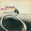
The Donald Byrd cover shown here is another masterpiece, incorporating concepts of negative space dating back to those first 1500 covers, along with a subtle refinement of typography and typically gutsy incorporation of the catalog number and logo into the delicate balance of the composition. Given the almost erotic focus on the Jaguar, it’s no surprise that Reid Miles himself took the photo. He once commented that it was his favorite design for the label.


